
Health
| Birth Rate per 1,000 | Fertility Rate per 1,000 | Deaths per 1,000 | % Living w/ a Disability | % w/ Public Health Insurance | % w/out Health Insurance |
|---|---|---|---|---|---|---|
Auburn | 9 | 26 | 5 | 8% | 19% | 5% |
Bedford | 7 | 68 | 10 | 8% | 19% | 2% |
Candia | 8 | 92 | 7 | 14% | 21% | 7% |
Chester | 8 | 11 | 4 | 8% | 21% | 2% |
Deerfield | 11 | 43 | 6 | 14% | 24% | 5% |
Derry | 10 | 48 | 7 | 12% | 27% | 5% |
Francestown | 6 | 32 | 7 | 7% | 30% | 5% |
Goffstown | 8 | 58 | 9 | 12% | 24% | 6% |
Hooksett | 10 | 42 | 7 | 13% | 26% | 4% |
Londonderry | 8 | 44 | 5 | 10% | 23% | 3% |
Manchester | 13 | 59 | 9 | 15% | 36% | 10% |
New Boston | 8 | 55 | 5 | 7% | 13% | 5% |
Weare | 9 | 38 | 4 | 7% | 16% | 5% |
Windham | 9 | 75 | 6 | 6% | 16% | 1% |
| Birth Rate per 1,000 | Fertility Rate per 1,000 | Deaths per 1,000 | % Living w/ a Disability | % w/ Public Health Insurance | % w/out Health Insurance | |
|---|---|---|---|---|---|---|
Hillsborough County | 10 | 54 | 8 | 12% | 28% | 6% |
Merrimack County | 9 | 43 | 10 | 14% | 31% | 6% |
Rockingham County | 9 | 47 | 8 | 11% | 26% | 5% |
Birth Rate per 1,000 | Fertility Rate per 1,000 | Deaths per 1,000 | % Living w/ a Disability | % w/ Public Health Insurance | % w/out Health Insurance | |
|---|---|---|---|---|---|---|
New Hampshire | 9 | 49 | 8 | 13% | 30% | 7% |
New England | 10 | 46 | 9 | 12% | 36% | 5% |
Northeast | 11 | 48 | 9 | 12% | 36% | 6% |
United States | 12 | 52 | 9 | 13% | 35% | 9% |
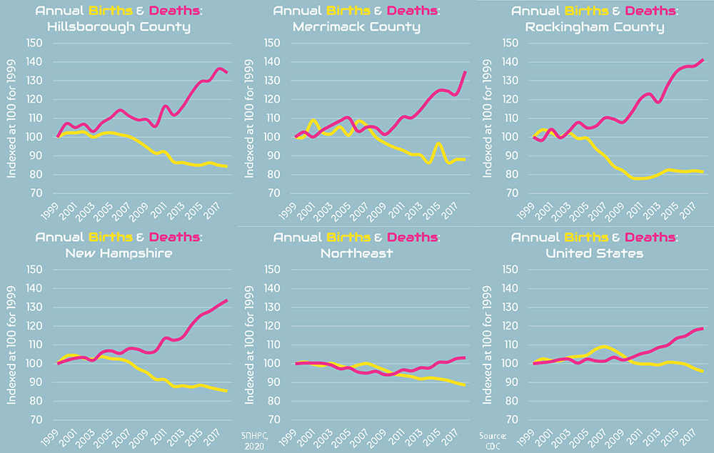
Birth and death rates reflect 2014-2018 Centers for Disease Control and Prevention averages for counties and larger geographies and 2013-2017 New Hampshire Department of Health & Human Services averages for municipalities. All other figures are derived from the U.S. Census Bureau's 2018 5-Year American Community Survey. Percentages and ratios have been rounded to the nearest integer.